The investigators struggle:
You have data in some file type (e.g. excel, csv, txt) that you collected with chart review—> e.g. “mydata.csv”. This data file might contain information about spine surgeries. For example, you may have 30 variables related to patient information (e.g. “height”, “weight”, “age”) as well as additional variables collected such as if they were readmitted or had a long hospital stay. The data is messy, has many missing values, some values that don’t make sense. You realize that your lab collected some information about some of the variables such as how they were collected in a google document and some of the variables are starting to make sense.
You are interested in some outcome variable that you collected in the above data. E.g. “I’m interested in all cause mortality”
Now you need to figure out which factors are most related to all cause mortality and how they are related. You can struggle with your favorite analysis software, or you can let us do the work for you.
We will tell you which risk factors are most associated with that outcome, how we came to that conclusion, and along finally we’ll give you the tables and graphs that are most needed for abstracts/posters/presentations/papers.
Once you fill out the “analyze your data” form, we will send you a link where you can upload your data. We will provide the results in the same link. All data that you upload will be permanently deleted from our servers within a week of uploading your results. This helps to ensure data breaches do not occur.
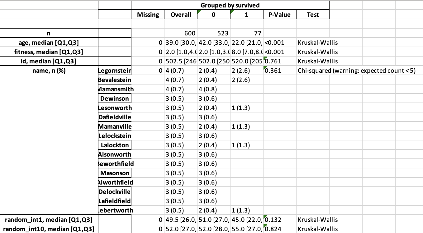
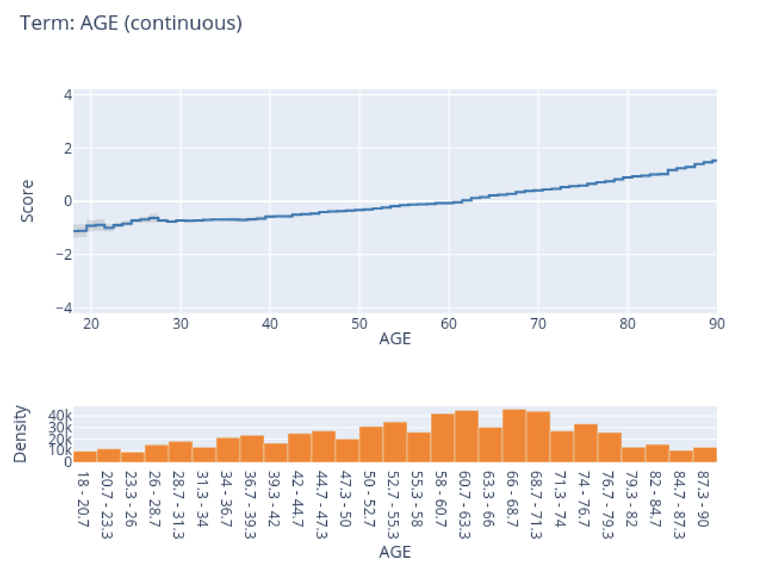
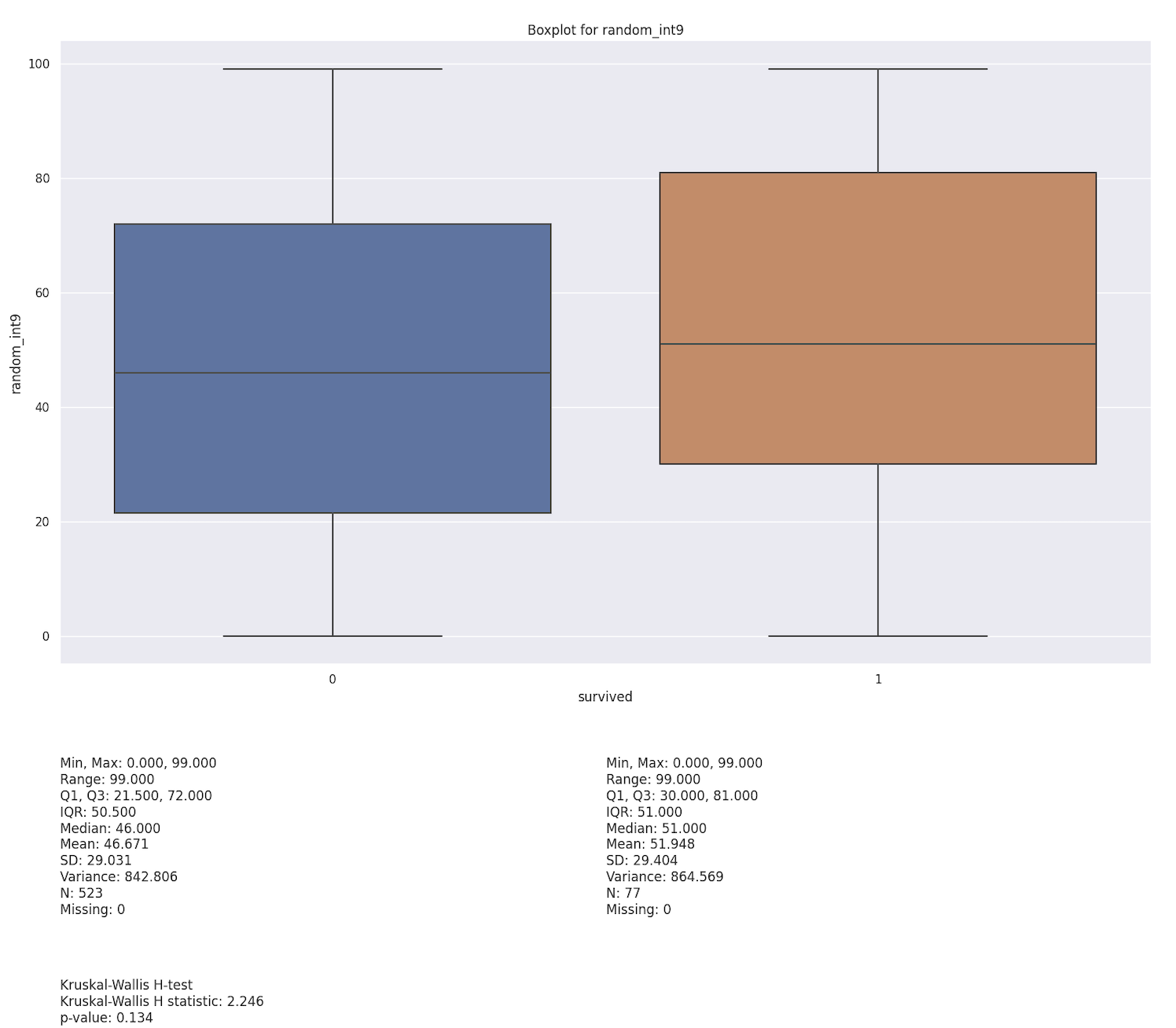
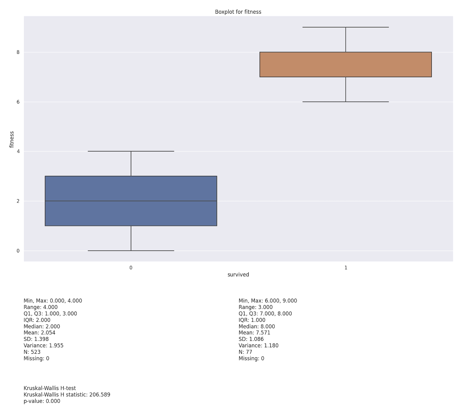
The below show just a few of the visualizations that are produced in process: